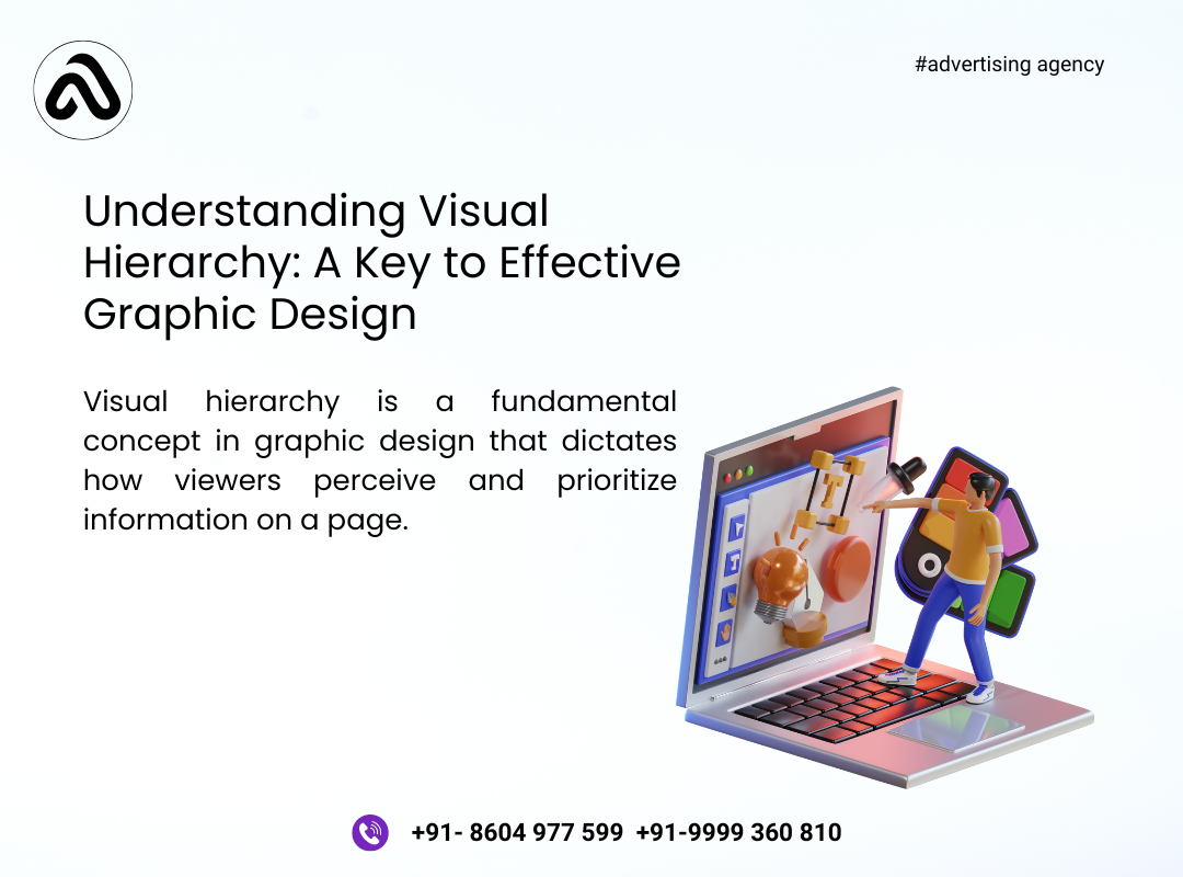
Understanding Visual Hierarchy: A Key to Effective Graphic Design
Visual hierarchy is a fundamental concept in graphic design that dictates how viewers perceive and prioritize information on a page. It involves organizing and presenting elements in a way that guides the viewer’s attention, making the content more accessible, engaging, and understandable. Mastering visual hierarchy is crucial for creating effective and impactful designs. This comprehensive guide explores the principles of visual hierarchy, its importance, and practical strategies for applying it in graphic design.
By Aayush
Cateogory : Graphics Design
Thank you! Your submission has been received!
Ooops! Something went wrong.
Share this article
Understanding Visual Hierarchy: A Key to Effective Graphic Design
Visual hierarchy is a fundamental concept in graphic design that dictates how viewers perceive and prioritize information on a page. It involves organizing and presenting elements in a way that guides the viewer’s attention, making the content more accessible, engaging, and understandable. Mastering visual hierarchy is crucial for creating effective and impactful designs. This comprehensive guide explores the principles of visual hierarchy, its importance, and practical strategies for applying it in graphic design.
What is Visual Hierarchy?
Definition: Visual hierarchy refers to the arrangement and presentation of elements in a design to indicate their order of importance. It directs the viewer's eye to the most important elements first and then guides them through the rest of the content in a logical and engaging manner.
Purpose:
Guide Attention: Helps direct the viewer’s focus to key information or calls to action.
Enhance Readability: Improves the readability and comprehension of the content by structuring it in a clear and logical manner.
Create Visual Flow: Establishes a visual flow that makes the content more engaging and easier to navigate.
Principles of Visual Hierarchy
1. Size and Scale
Objective: Utilize size and scale to emphasize the importance of elements.
Key Points:
Larger Elements: Larger elements naturally draw more attention and are perceived as more important. Use larger fonts, images, or graphics for headlines or key messages.
Hierarchy of Sizes: Establish a hierarchy by varying the sizes of elements. For example, headlines should be larger than subheadings, which should be larger than body text.
Applications:
Headings and Subheadings: Use larger fonts for headings and slightly smaller fonts for subheadings to create a clear hierarchy.
Call to Action (CTA): Make CTA buttons larger and more prominent to attract attention and encourage action.
2. Color and Contrast
Objective: Leverage color and contrast to highlight important elements and create visual interest.
Key Points:
High Contrast: High contrast between text and background makes content more readable and draws attention to important elements. Use contrasting colors for headlines and key messages.
Color Emphasis: Use color strategically to highlight or differentiate elements. For instance, use a bright color for CTAs or important information.
Applications:
Highlighting: Apply a bold or contrasting color to key phrases or sections to make them stand out.
Backgrounds: Use contrasting backgrounds to separate different sections of content and guide the viewer’s eye.
3. Typography
Objective: Employ typography to create a clear hierarchy and enhance readability.
Key Points:
Font Choice: Use different font styles (serif, sans-serif, script) to distinguish between different types of content. Choose fonts that align with the brand and the design’s tone.
Font Weight and Style: Vary font weights (bold, regular, light) and styles (italic, underline) to create emphasis and guide the viewer’s attention.
Applications:
Headlines and Body Text: Use distinct fonts or styles for headlines, subheadings, and body text to establish a clear hierarchy.
Emphasis: Apply bold or italic styles to highlight important information or quotes.
4. Alignment and Spacing
Objective: Use alignment and spacing to create a structured and visually appealing layout.
Key Points:
Alignment: Align text and elements to create a cohesive and organized look. Consistent alignment (left, center, right) helps guide the viewer’s eye through the content.
Spacing: Utilize spacing (padding, margins) to separate elements and create a sense of order. Adequate spacing prevents visual clutter and enhances readability.
Applications:
Grid Systems: Implement a grid system to align elements and maintain consistency across the design.
Whitespace: Incorporate whitespace to give elements room to breathe and emphasize key content.
5. Visual Weight and Focus
Objective: Manipulate visual weight to direct attention and establish importance.
Key Points:
Visual Weight: The visual weight of an element is determined by its size, color, and complexity. Heavier elements draw more attention, while lighter elements recede into the background.
Focus: Use visual weight to create focal points and guide the viewer’s attention to the most important elements.
Applications:
Focal Points: Design focal points with high visual weight (e.g., bold colors, large images) to draw attention to key areas.
Secondary Elements: Use lighter or smaller elements for secondary information to maintain a clear hierarchy.
6. Imagery and Graphics
Objective: Incorporate imagery and graphics to enhance the visual hierarchy and support the content.
Key Points:
Visual Interest: Use images and graphics to break up text and add visual interest. Ensure that visuals complement and enhance the content rather than distract from it.
Relevance: Choose imagery that is relevant to the content and aligns with the brand’s message.
Applications:
Hero Images: Use large, impactful images at the top of the design to grab attention and set the tone.
Supporting Graphics: Include graphics or icons to illustrate points or highlight key information.
Practical Strategies for Applying Visual Hierarchy
1. Start with a Clear Goal
Objective: Define the primary goal of the design to guide the application of visual hierarchy.
Key Points:
Identify Key Messages: Determine the main messages or calls to action that need to be emphasized.
Set Priorities: Establish the order of importance for different elements based on the design’s objectives.
Applications:
Content Planning: Plan the layout and design elements around the key messages and goals.
Design Focus: Ensure that the most important information is given prominence in the design.
2. Use Hierarchical Structure
Objective: Create a clear hierarchical structure to organize and present content effectively.
Key Points:
Visual Hierarchy: Establish a visual hierarchy by arranging elements in order of importance. Use size, color, and typography to differentiate between primary, secondary, and tertiary information.
Content Blocks: Organize content into blocks or sections to create a structured and easy-to-navigate layout.
Applications:
Layout Design: Arrange elements in a logical flow, guiding the viewer’s eye from the most important to the least important information.
Section Headings: Use distinct section headings to separate different content areas and improve readability.
3. Optimize for Readability
Objective: Enhance the readability of the design by applying visual hierarchy principles.
Key Points:
Text Hierarchy: Use different font sizes, weights, and styles to create a clear hierarchy for text content.
Contrast and Legibility: Ensure sufficient contrast between text and background to enhance legibility.
Applications:
Content Hierarchy: Structure text content with clear headings, subheadings, and body text to facilitate easy reading.
Contrast Checks: Test text and background colors to ensure readability across different devices and environments.
4. Test and Refine
Objective: Test the design to ensure that the visual hierarchy effectively guides the viewer’s attention and achieves the desired impact.
Key Points:
User Testing: Conduct tests with real users to gather feedback on the design’s effectiveness and clarity.
Refinement: Make adjustments based on feedback and testing results to improve the visual hierarchy and overall design.
Applications:
A/B Testing: Perform A/B testing to compare different design variations and determine which one performs better.
Feedback Analysis: Analyze user feedback to identify areas for improvement and refine the design accordingly.
5. Stay Consistent
Objective: Maintain consistency in visual hierarchy across all design elements and touchpoints.
Key Points:
Consistency in Design: Apply consistent design elements (fonts, colors, sizes) to create a cohesive and recognizable visual identity.
Brand Guidelines: Follow brand guidelines to ensure that the visual hierarchy aligns with the brand’s standards and messaging.
Applications:
Design Systems: Develop and use design systems to ensure consistency across different designs and platforms.
Brand Alignment: Ensure that the visual hierarchy supports and reinforces the brand’s identity and values.
Examples of Effective Visual Hierarchy
1. Website Design
Objective: Apply visual hierarchy to create an engaging and user-friendly website.
Key Points:
Hero Section: Use a large, attention-grabbing hero image with a clear headline and CTA button.
Content Layout: Organize content into sections with clear headings and visual cues to guide users through the site.
Applications:
Landing Pages: Design landing pages with a strong visual hierarchy to drive conversions and achieve marketing goals.
Navigation: Use visual hierarchy to create intuitive navigation menus and improve user experience.
2. Print Design
Objective: Utilize visual hierarchy to create effective and visually appealing print materials.
Key Points:
Headlines and Subheadings: Use large headlines and subheadings to capture attention and structure the content.
Visual Emphasis: Apply color and typography to highlight key information and create visual interest.
Applications:
Brochures and Flyers: Design brochures and flyers with a clear visual hierarchy to convey information effectively.
Posters: Use bold visuals and typography to create impactful posters with a clear message.
3. Social Media Graphics
Objective: Leverage visual hierarchy to create engaging and shareable social media graphics.
Key Points:
Attention-Grabbing Elements: Use bold headlines, vibrant colors, and compelling images to capture attention in social media feeds.
Clear Messaging: Ensure that key messages and CTAs are prominently displayed and easy to understand.
Applications:
Ads and Promotions: Design social media ads with a strong visual hierarchy to drive engagement and conversions.
Infographics: Create infographics with a clear hierarchy to present data and information in an engaging manner.
Conclusion
Visual hierarchy is a critical aspect of effective graphic design, guiding the viewer’s attention and enhancing the clarity and impact of the content. By understanding and applying the principles of visual hierarchy—such as size and scale, color and contrast, typography, alignment and spacing, visual weight, and imagery—designers can create designs that are not only visually appealing but also effective in communicating key messages.
Mastering visual hierarchy involves defining clear goals, creating a structured layout, optimizing readability, testing and refining designs, and maintaining consistency. Whether working on websites, print materials, or social media graphics, applying these principles will help designers craft compelling and impactful designs that resonate with their audience and achieve their objectives.
Embrace the art of visual hierarchy to elevate your graphic design skills and create designs that effectively communicate and engage. By focusing on the principles and practical strategies outlined in this guide, you’ll be well-equipped to design with purpose and create visually compelling experiences.